Client
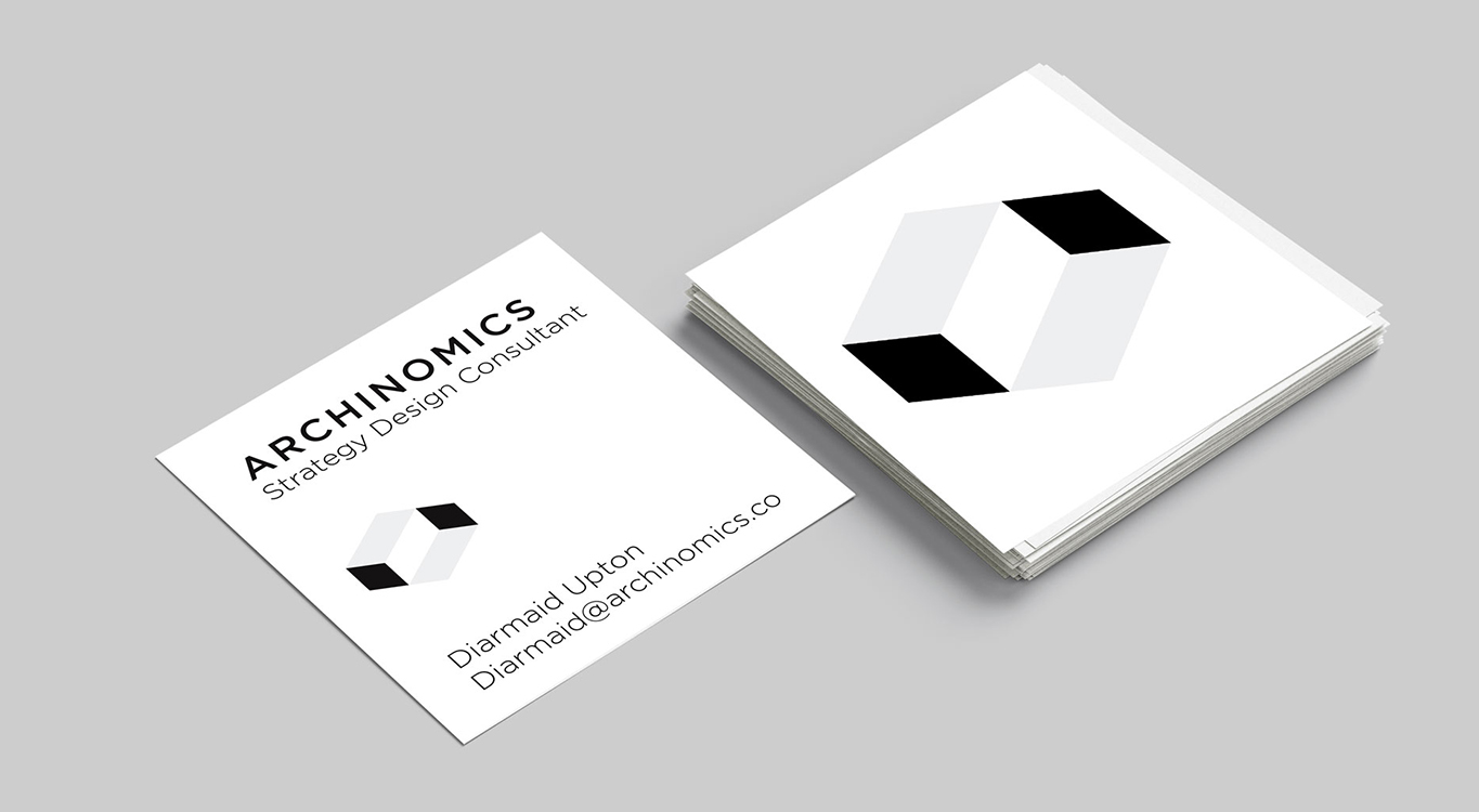
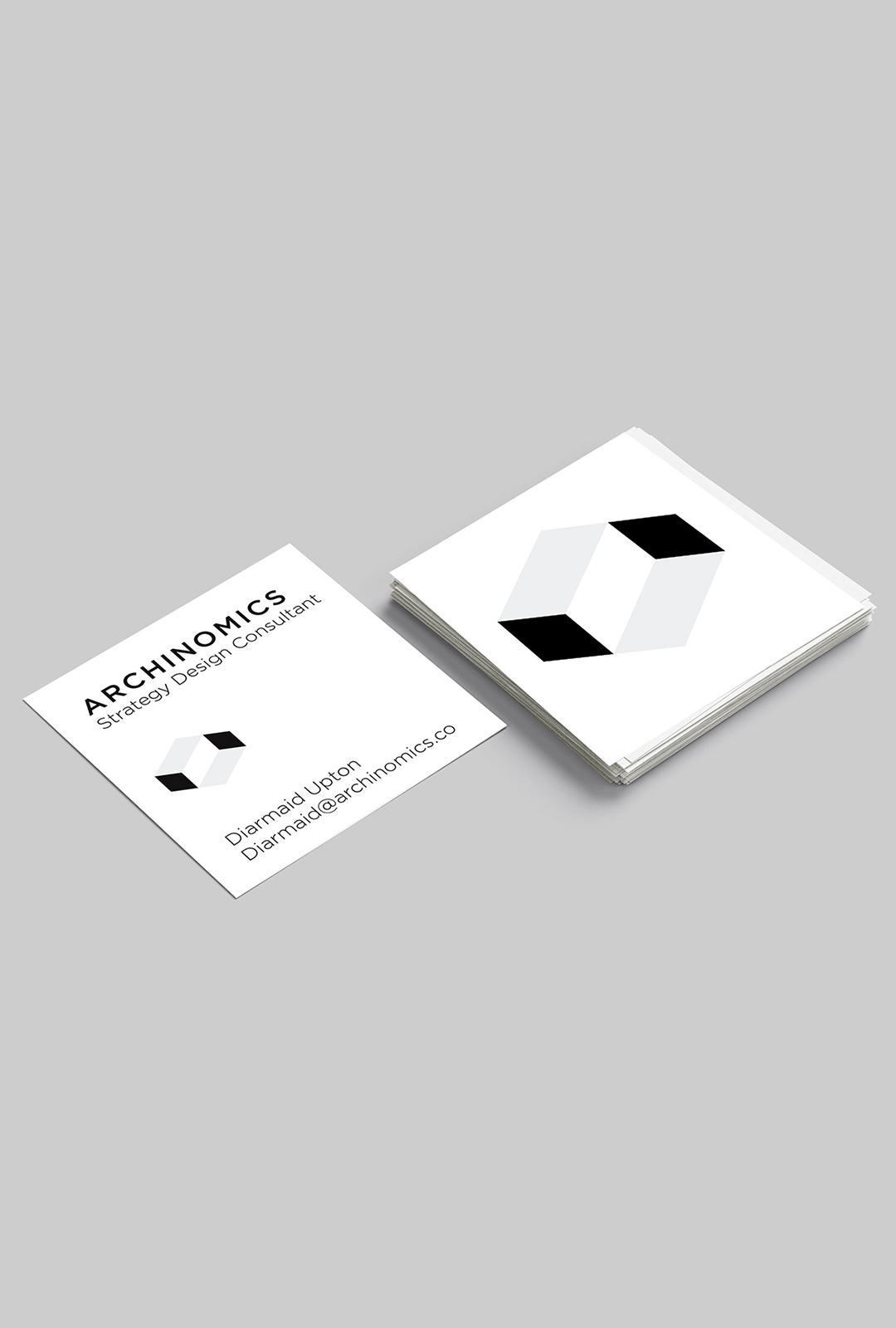
ARCHINOMICS
BRANDING
Year
2016
CREATIVE DIRECTION / GRAPHIC DESIGN
CREATIVE DIRECTION /
GRAPHIC DESIGN /
GRAPHIC DESIGN /
Archinomics
A 4th Industrial Revolution architectural practice, specialising in designig optimal spaces for creativity and collaboration within horizontal business models.
Archinomics needed to secure funding for its projects, which meant the brand had to do more than represent the practice — it had to build credibility, communicate innovation, and translate complex architectural thinking into something investors could immediately grasp. The visual identity answered this challenge by transforming abstract concepts into a clear, structured system.
The Escher-inspired multidimensional form symbolized strategic thinking, spatial intelligence, and the ability to see multiple perspectives — qualities essential for future-focused investment. Its dual reading as both solid structure and negative space reinforced the idea that Archinomics designs not just buildings, but the environments between people, systems, and ideas.
By developing a modular five-faced visual language, the brand became dynamic and scalable, capable of adapting across pitch decks, digital platforms, and spatial presentations. This consistency strengthened investor trust, positioning Archinomics as structured, forward-thinking, and system-oriented rather than experimental or purely conceptual.


The introduction of Aya further humanized the narrative, making complex architectural innovation accessible and emotionally engaging — an important factor when communicating visionary ideas to stakeholders and funders.

