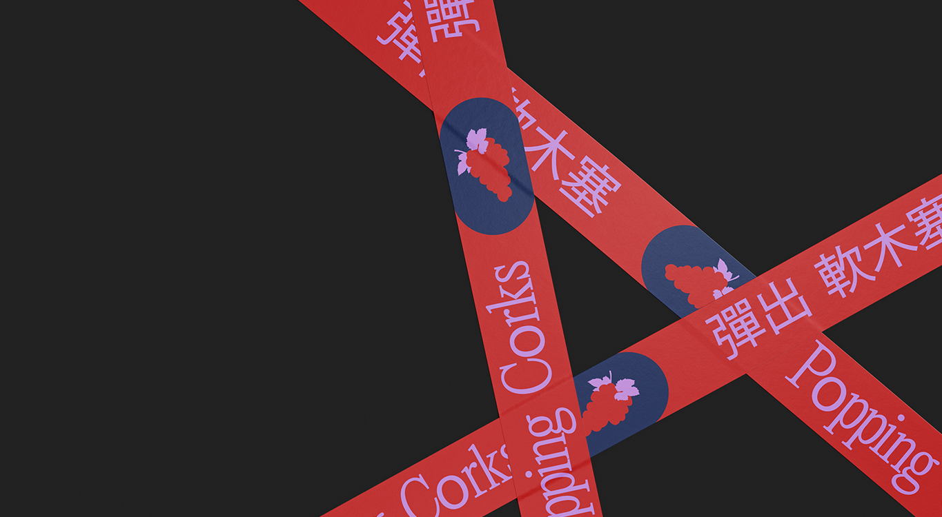
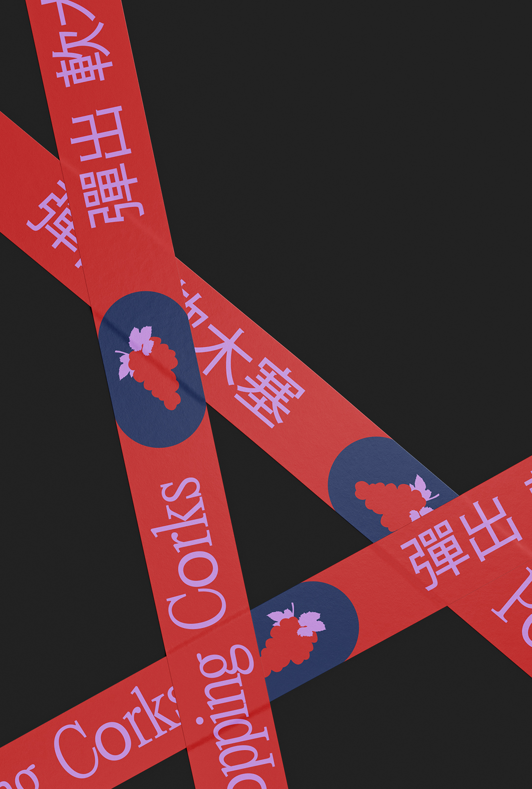
POPPING CORKS
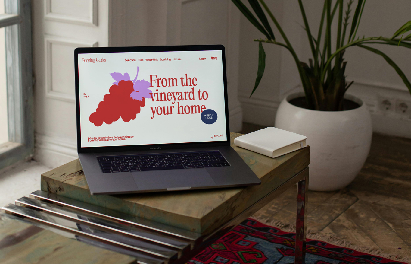
Visual identity that bridges heritage and technology, translating blockchain transparency into a warm, culturally resonant brand system. By using the metaphor of the cork’s expansion and a color palette rooted in Chinese symbolism, the brand communicates trust, traceability, and celebration — positioning Popping Corks as a transparent, cross-border wine experience from vineyard to home.
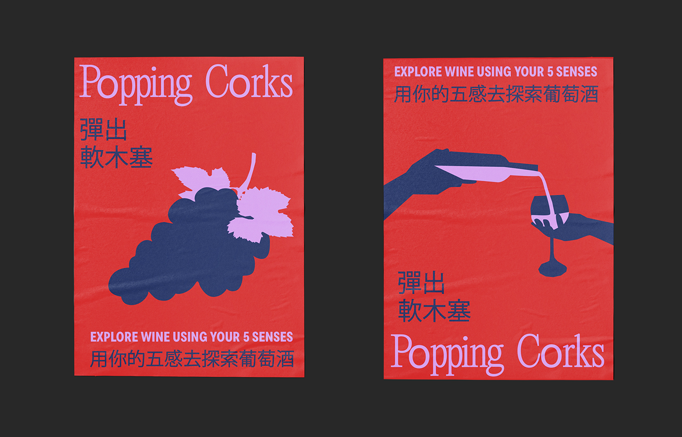
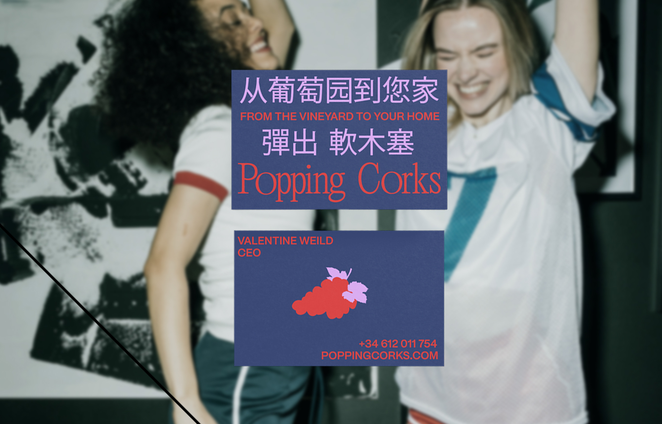
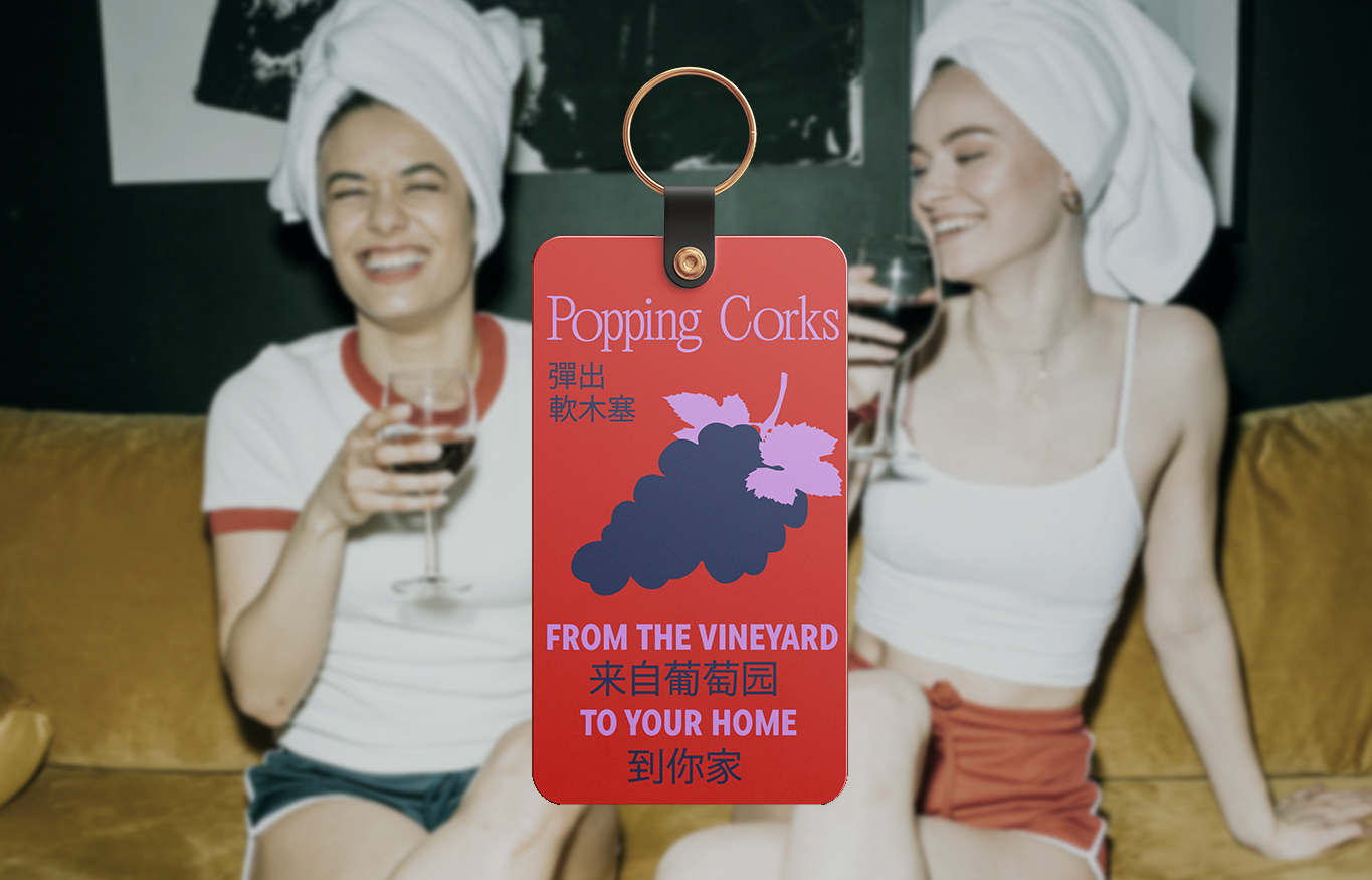
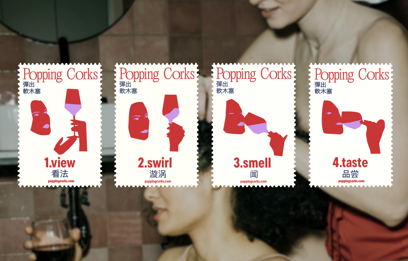
A cut-out illustration style built from simplified layered shapes creates a playful, tactile quality that contrasts with the invisible infrastructure of blockchain, making the brand feel accessible and human rather than purely technical. The illustrations also introduce movement and spontaneity.
This expressive graphic language is paired with an elegant editorial serif typeface, grounding the brand in the sophistication and tradition associated with European wine culture and reinforcing its premium positioning.
Together, these elements form a modular and scalable visual language that can expand across packaging, digital platforms, and storytelling touchpoints, allowing the brand to communicate transparency, cultural exchange, and sensory discovery within a modern cross-border wine ecosystem.